Image ChatGPT Image 2
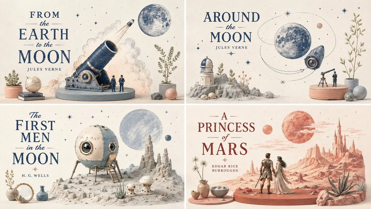
A 2x2 grid of four open books with botanical miniatures
Four open books form a grid, each filled with tiny sculpted plants and pastel still-life objects in a clean editorial style.
Prompt
16:9, 2x2 grid, pick 4 non copyrighted, open space books, Style = <graphic_botanical_editorial_miniworld> MEDIUM: Hybrid of limited-palette risograph illustration, pastel still-life styling, and tiny environmental diorama storytelling. MATERIAL: Printed ink texture, matte paper, soft ceramic-like props, miniature sculpted foliage, and lightly tactile pastel set pieces. SURFACE: Grainy drawn marks combined with smooth simplified volumes and faint paper or powder texture. GEOMETRY: Flat-to-shallow space hybrid; some forms read as drawn silhouettes while others become tiny sculptural miniatures. COLOR: Selective two-to-four color palette built around one strong print color plus pale pastel support tones such as sky blue, pink, cream, mint, and light peach. LIGHTING: Bright and soft with understated depth cues; shadows are simple and gentle, never dramatic. COMPOSITION: Editorial poster clarity with curated object placement, negative space, and small clusters of miniature world detail. MOOD: Clever, stylish, handcrafted, contemporary, airy, and quietly playful. </graphic_botanical_editorial_miniworld> <transformation> - Preserve the subject’s recognizable structure, but reinterpret it as a stylized editorial composition where drawing and miniature object-world logic coexist. - Convert some forms into sparse grainy line illustration while converting other forms into soft pastel miniatures or still-life objects. - Reinterpret texture-rich or detailed areas as small clusters of plants, props, vessels, terrain fragments, or decorative micro-world motifs. - Convert smooth surfaces into matte pastel color fields, while using graphic linework to describe edges, volume, and texture selectively. - Reduce complexity into a limited color system with one dominant graphic ink tone and a few quiet pastel support colors. - Replace deep realism with poster-like clarity, paper-print tactility, and curated tabletop arrangement. - Allow the subject to feel partially drawn and partially physically staged, creating a deliberate ambiguity between illustration and object. - Use negative space and sparse composition to keep the image clean, modern, and highly readable. </transformation> <shape_language> - Favor simple containers, rounded objects, leaves, stems, pebbles, tabletop silhouettes, miniature clusters, and clean abstract forms. - Use a mix of flat contour areas and soft low-relief sculptural accents. - Keep repetition rhythmic and decorative. - Let small details feel intentional and editorial rather than busy. </shape_language> <rendering_rules> - Use visibly grainy printed or crayon-like marks for lines and texture accents. - Keep volumetric forms soft, simplified, and pastel. - Limit the palette aggressively for a designed, print-friendly look. - Use shallow spatial depth with subtle diorama hints. - Make the final result feel like an art print, a magazine illustration, and a miniature set all at once. </rendering_rules> <finish> - Graphic limited-palette editorial hybrid. - Printmaking texture fused with soft pastel mini-world staging. - Smart, modern, collectible, and quietly distinctive. </finish> <avoid> - Avoid photoreal rendering. - Avoid deep cinematic perspective or strong realism. - Avoid overstuffing with too many tiny details. - Avoid using too many colors; keep it controlled and designed. </avoid> }
Published: July 1, 2026 by Gadgetify