Image ChatGPT Image 2
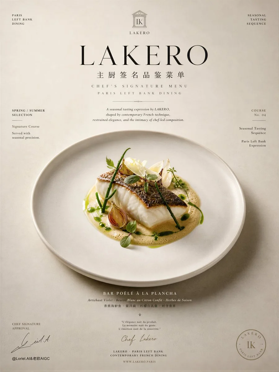
A butter-poached fish rests on a pristine white plate
A single, perfectly cooked fish fillet with silky sauce, micro herbs, and seasonal vegetables on clean porcelain, evoking Michelin-level precision.
Prompt
Create an ultra-premium editorial poster for LAKERO, designed as a chef’s signature tasting menu visual for the same Paris Left Bank fine-dining series. The image must feel like a refined Michelin-level signature menu card enlarged into a museum-grade campaign poster: elegant, literary, chef-driven, architectural, and deeply restrained. Preserve the original LAKERO brand world of Paris Left Bank sophistication, contemporary French fine dining, quiet luxury, and tasting-menu refinement, but now shift the composition so it feels unmistakably like a signed chef’s menu presentation.

Use a vertically oriented composition with strong menu-like structure and exceptional negative space. The design should feel like a luxury printed tasting menu sheet transformed into a high-end campaign image. Build the layout around a central plated signature dish, surrounded by carefully arranged editorial text zones, subtle information blocks, refined spacing, and elegant visual hierarchy. The overall composition must feel calm, precise, and highly authored.

The key concept is:
LAKERO as a Paris Left Bank chef-led restaurant,
presenting a signature tasting menu with the authority and intimacy of a chef’s personal culinary statement.
The poster should feel like a seasonal menu cover and internal signature page merged together:
part fine-dining campaign,
part chef manifesto,
part luxury print object.

Place one Michelin-level French signature dish at the visual center of the poster.
This dish must feel like the chef’s defining plate:
hyper-real,
precisely composed,
quietly luxurious,
and visually unforgettable.
Possible direction:
a refined contemporary French tasting plate with butter-poached fish or roasted poultry,
silky sauce architecture,
seasonal vegetables,
micro herbs,
precise garnish placement,
clean porcelain,
and disciplined negative space.
The food must be rendered with world-class realism and remain the emotional core of the image.

The plate should not feel crowded.
It must feel intentional, signature-driven, and worthy of a chef’s name.
Every detail should suggest discipline, elegance, and culinary authorship:
micro moisture on produce,
silky gloss on sauce,
subtle roasted texture,
clean plate rim,
fine ingredient fibers,
and exact garnish positioning.

Around the hero dish, build a menu-inspired editorial layout:
a refined title zone near the top,
smaller descriptive text blocks,
subtle divider rules,
possibly a course label or seasonal notation,
and a lower area that suggests chef signature authority.
The layout should feel like a premium tasting menu page rather than a commercial advertisement.
Typography and spacing must do as much work as the imagery.

Establish LAKERO clearly as the restaurant brand.
Create a bespoke LAKERO logo consistent with the existing series:
minimal,
architectural,
Parisian,
timeless,
editorial,
and internationally premium.
The logo should appear with calm authority near the top of the layout or in a refined menu-header position.

Typography must follow a chef’s signature menu logic:
main English title: “LAKERO”
small Chinese subtitle: “主厨签名品鉴菜单”
Optional supporting English lines:
“Chef’s Signature Menu”
“Paris Left Bank Dining”
“Seasonal Tasting Sequence”
Add a short refined English introduction such as:
“A seasonal tasting expression by LAKERO, shaped by contemporary French technique, restrained elegance, and the intimacy of chef-led composition.”
You may also include small menu-like supporting text fragments, such as:
“Spring / Summer Selection”
“Signature Course”
“Served with seasonal precision”
Typography should feel literary, couture-editorial, and menu-authentic, with beautiful hierarchy, generous spacing, and subtle refinement. Avoid loud advertising typography, generic menu fonts, or cluttered copy.

To strengthen the chef-authored feeling, introduce one discreet signature detail:
a subtle handwritten-style chef signature element,
a refined initials mark,
or a delicate script-like approval mark near the bottom portion of the layout.
It must feel premium, understated, and believable, never decorative or exaggerated.

Lighting must be soft, cinematic, and intimate:
gentle top or side directional light,
quiet shadow transitions,
subtle porcelain reflections,
fine highlights on sauce and ingredients,
and elegant tonal falloff across the page.
The image should feel like Parisian fine-dining still life photographed for a luxury editorial menu publication.

Color palette should remain consistent with the existing LAKERO Paris Left Bank series:
warm black,
deep charcoal,
stone gray,
ivory,
butter cream,
sage green,
champagne beige,
soft roast gold,
and restrained linen tones.
The palette must feel cultivated, understated, and Michelin-luxury in tone.

Background and spatial design should feel like a premium printed menu object:
soft paper-like field,
pale stone or warm ivory surface,
or a restrained dark-light contrast with clear architectural zones.
Use minimal graphic dividers, subtle layout lines, and elegant spacing to suggest a chef’s printed signature menu.
No casual restaurant interior,
no diners,
no bottle-centered theme,
no food collage,
no decorative clutter.

Overall mood:
chef-authored, Parisian, Michelin-inspired, literary, intimate, editorial, restrained, signature-driven, luxurious, intelligent, world-class.

Rendering style:
hyper-realistic fine-dining food photography, Paris Left Bank chef’s signature menu poster, bespoke LAKERO restaurant logo, elegant menu-inspired typography, soft cinematic luxury lighting, Michelin-level plate styling, refined editorial negative space, premium print-object composition, 8k, world-class commercial quality.

Negative prompt:
busy menu board, alcohol hero theme, bottle-centered composition, cheap restaurant flyer, casual dining mood, cluttered collage, rustic bistro styling, generic logo, crowded typography, loud ad layout, flat lighting, fast food styling, cartoon food, messy plating, brochure design look, noisy props, bright commercial background, low-end restaurant branding
Published: July 10, 2026 by Loriel.AI