Image ChatGPT Image 2
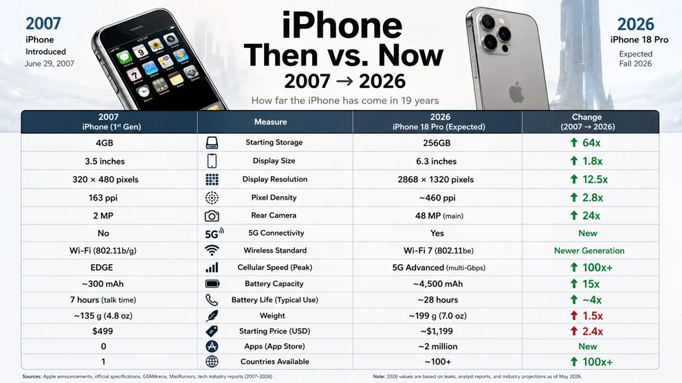
A clean editorial infographic compares the iPhone from 2007 to 2026.
This clean editorial infographic contrasts the iPhone's 2007 debut with its 2026 state. Six to fourteen key measures like screen size, camera megapixels, and processing power are shown with semantic icons, start/end values, and change indicators, all in a muted-to-contrasting color scheme.
Prompt
16:9, iphone, when it was introduced to 2026, do research: global_variables ::= subject ::= [cohort / country / industry / product / technology / city / institution / phenomenon] start_point ::= [date / era / version / baseline state] end_point ::= [date / era / version / present/future state] interval ::= derive_time_or_stage_gap(start_point, end_point) measure_count ::= [6..14] candidate_measures ::= infer_comparable_high_information_metrics(subject) measures ::= select_top_k(candidate_measures, measure_count) start_values ::= retrieve_or_user_supply(measures, start_point) end_values ::= retrieve_or_user_supply(measures, end_point) change_mode ::= infer(best of ratio | percent | absolute_delta | years | x-fold | fewer/more) change_values ::= calculate(start_values, end_values, change_mode) icon_set ::= infer_semantic_icon_per_measure start_visual ::= infer_visual_cue_for(subject, start_point) end_visual ::= infer_visual_cue_for(subject, end_point) color_start ::= infer_muted_baseline_color color_end ::= infer_contrasting_current_color direction_colors ::= semantic_positive_negative_or_neutral style ::= clean editorial comparison infographic input ::= [subject], [start_point], [end_point] generate a clean editorial infographic comparing subject at start_point versus end_point. infer: - 6–14 high-information measures that are valid at both points - comparable units - semantic icons - the most intuitive change expression for each row - contextual visuals representing the beginning and end states composition: top: - small start_point marker on left - large central headline derived from subject + interval - end_point marker on right - subtle contextual imagery from each era/state main table: column_1 = start_point column_2 = measure column_3 = end_point column_4 = change for every measure: - show start_value - show semantic icon - concise measure label - show end_value - calculate and display change_value - use directional arrow when meaningful rules: - measures must be directly comparable - units must remain consistent - do not mix unrelated baselines - biggest changes should be readable instantly - all values and labels derive from subject and supplied/retrieved data - do not invent factual data
Published: August 26, 2026 by Gadgetify