Image ChatGPT Image 2
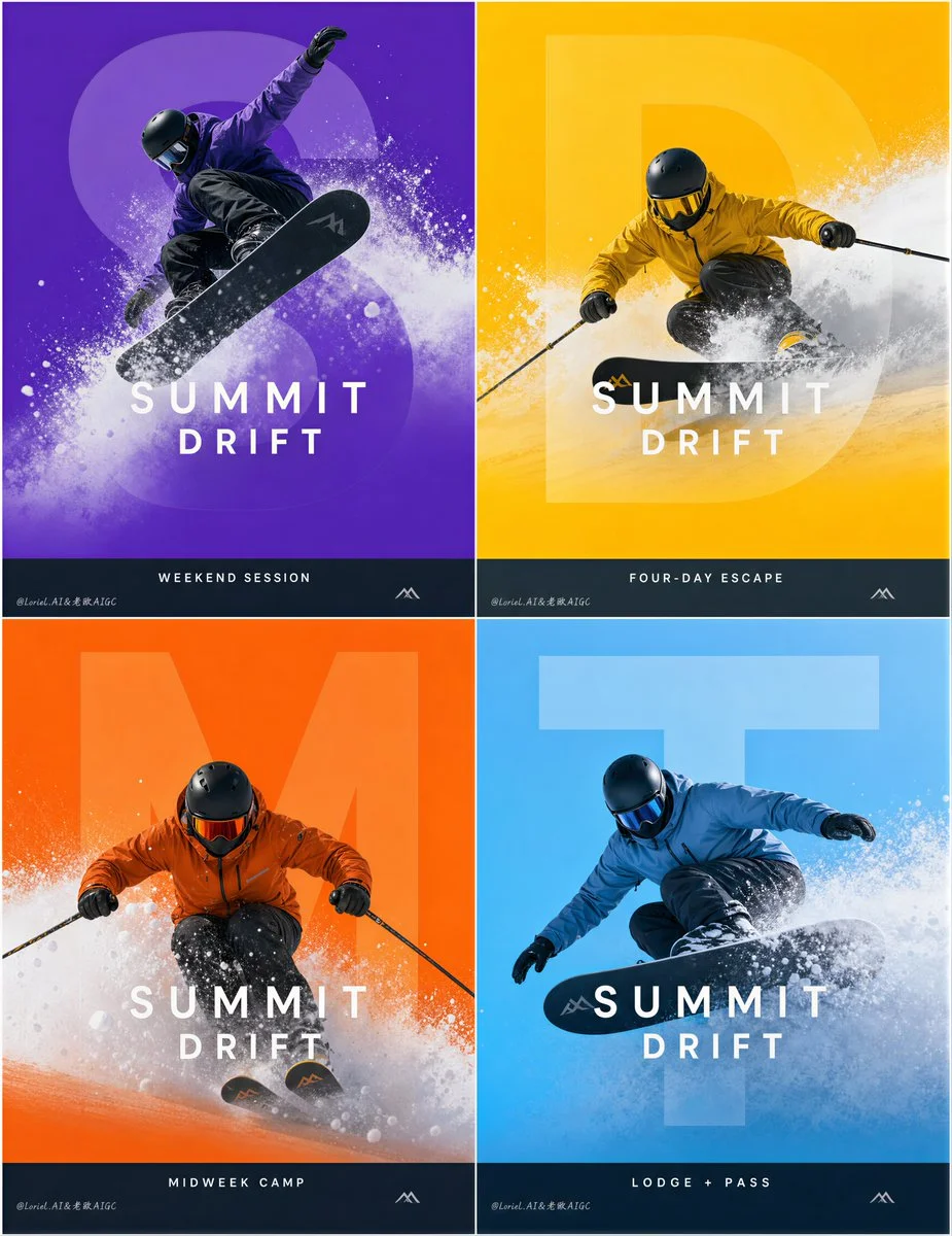
A skier carves through a giant translucent purple letter S
An anonymous freestyle skier slices across a massive, soft-edged purple letterform, with powder snow veiling the graphic. The composition layers athlete, letter, and snow in a clean, premium brand system.
Prompt
Create an ultra-premium 2x2 winter-sports campaign poster board for a fictional international alpine lifestyle brand, designed as a Cannes-award-level advertising system with extreme realism, immaculate graphic discipline, and collector-grade print finish. Preserve the exact structural logic of four equal poster panels arranged in a perfect 2-by-2 grid. Each poster must feature one anonymous skier or snowboarder as the hero, one oversized semi-transparent letterform embedded as the main graphic structure, one vivid monochrome background, dynamic powder snow crossing through the composition, a refined campaign title block in the middle area, and a clean informational line near the bottom. The final board must feel like an official flagship launch campaign for a luxury winter-sports brand: energetic, graphic, premium, and publication-ready.

Core campaign system:
Use a perfectly aligned 2x2 layout with equal panel sizes, unified margins, identical spacing logic, and one invisible master grid governing all four posters. Every panel must share the same visual grammar:
1. one anonymous winter athlete as the main subject,
2. one giant translucent letterform as the background anchor,
3. one bold flat-color field,
4. one dynamic snow burst crossing the center,
5. one refined brand-title zone placed in the middle,
6. one clean bottom information strip.
The whole board must read as one disciplined master campaign, not four separate posters.

Brand identity:
Invent a refined original alpine campaign brand such as:
SUMMIT DRIFT
Use it consistently as the main brand title across all four panels. All visible wording must be newly invented and original. Do not copy any wording from the reference. Do not include any real person names.

Graphic letterform system:
The oversized translucent letterform is one of the most important devices in the campaign. It must feel large, soft-edged, semi-transparent, elegant, and fully integrated into the composition. The athlete and snow spray must interact with it in a controlled premium way:
- some parts of the athlete must cut across the letterform,
- some snow must veil parts of the letterform,
- some areas of the title may sit over or within the letter structure,
- the letter must stay readable as a graphic symbol without overwhelming the athlete,
- the full relationship between athlete, letter, and snow must feel clean, deliberate, and systematized.

Panel 1, freestyle impact:
Use a rich electric purple background. Show an anonymous snowboarder captured midair in a stylish freestyle trick, with the snowboard crossing diagonally and powder exploding behind and beneath the figure. The body should feel athletic, youthful, and sharply posed. The translucent letterform must sit large behind the action and the snow must partially obscure it. Middle title:
SUMMIT DRIFT
Bottom line:
WEEKEND SESSION

Panel 2, velocity carve:
Use a bold golden-yellow background. Show an anonymous skier aggressively carving through bright powder, torso leaning forward with dynamic speed and technical control. The snow burst must slice across the letterform and partially veil the title zone. This panel should feel fast, premium, and sharply directional. Middle title:
SUMMIT DRIFT
Bottom line:
FOUR-DAY ESCAPE

Panel 3, alpine discipline:
Use a saturated rescue-orange background. Show an anonymous skier in a powerful training descent posture with poles extended and lower body engaged, throwing dense powder outward. The giant translucent letterform must anchor the composition behind the athlete while the figure cuts across it with strong contrast. This panel should feel sport-driven, disciplined, and performance-focused. Middle title:
SUMMIT DRIFT
Bottom line:
MIDWEEK CAMP

Panel 4, cold-flow glide:
Use a premium ice-blue background. Show an anonymous snowboarder sweeping laterally in a low carving motion, with the snowboard edge sending powder across the lower-middle portion of the frame. The composition should feel fluid, contemporary, and technically refined. The snow, body, and letterform must integrate with strong graphic clarity. Middle title:
SUMMIT DRIFT
Bottom line:
LODGE + PASS

Typography and layout:
Use a refined contemporary uppercase sans-serif title system with strong geometric clarity and premium spacing. Keep the title positioned consistently in the middle area across all four posters. The bottom information strip must align identically across the series, with equal height, equal margins, and uniform typographic rhythm. Add a very subtle secondary alpine signature near the lower area if needed, but keep it minimal and clean. No crude fonts, no clutter, no copied wording.

Athlete realism:
Push all figures, helmets, goggles, gloves, technical outerwear, skis, snowboards, and powder texture to elite advertising realism. Show believable fabric tension, matte shell materials, reflective goggle lenses, crisp edge highlights, realistic cold-weather light, and sharp athletic posture. The athletes must remain anonymous, non-celebrity, and aspirational.

Snow and motion language:
The powder snow is essential to the campaign identity. It must feel explosive, airy, cold, and sculptural, with fine particle breakup, directional spray, soft mist edges, and believable depth. The snow should enhance speed, impact, and spatial layering without obscuring the subject too much. Across the four posters, unify the snow behavior into one mature campaign language.

Color and print finish:
Each panel must own a distinct seasonal color world while remaining part of one controlled family: electric purple, golden yellow, saturated orange, and ice blue. The color fields must feel perfectly flat, rich, and premium, like luxury printed posters. Emphasize collector-grade print quality, crisp snow edges, elegant transparency in the letterforms, and a fully resolved advertising finish suitable for resort launch walls, editorial spreads, brand books, outdoor displays, and collectible poster editions.

Creative emphasis:
Combine three layers in one final result:
Orbit-level impact through stronger athlete motion, more explosive powder spray, and more commanding color-block energy;
Transit-level maturity through stricter alignment, unified letterform sizing, cleaner title hierarchy, and equalized information-zone discipline;
Port-level completeness through luxury print texture, premium transparency control, and a fully resolved collector-edition winter campaign atmosphere.

No copied text, no real person names, no awkward anatomy, no cheap sports-flyer styling, no stock-photo feeling, no cluttered layout, no weak typography, no messy snow effects.
Published: August 6, 2026 by Loriel.AI