Image Nano Banana 2
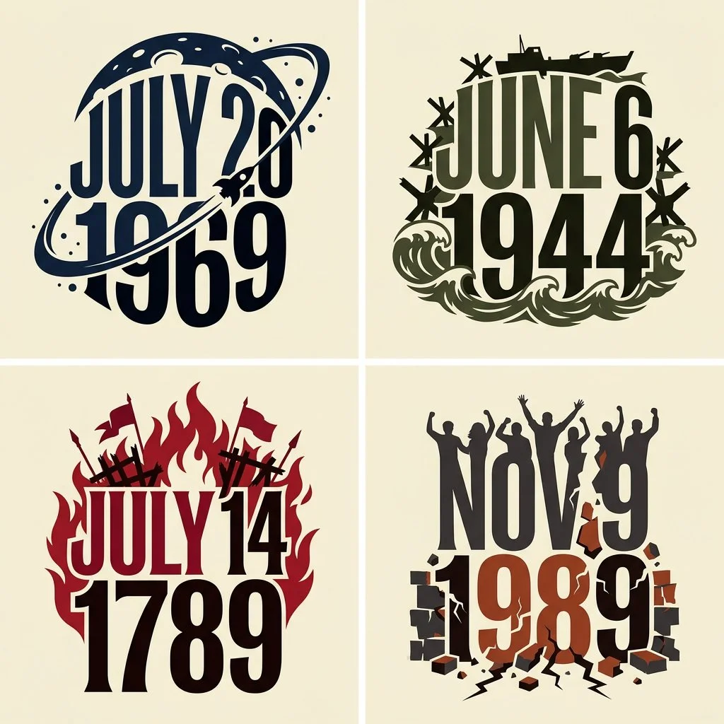
Bold Typographic Artwork Maps Four Days That Shook History
A 2x2 grid of conceptual typographic panels, each transforming a historic day into expressive lettering fused with a symbolic motif on warm ivory.
Prompt
2x2 grid, do this for 4 days that changed history
FORMAT: wide landscape, 16:9
Create a compact conceptual typographic artwork displaying the subject in uppercase. Combine expressive custom lettering with ONE subject-specific visual motif, forming a single unified graphic silhouette on warm ivory.
DESIGN FOUNDATION — KEEP FIXED
Make the word the dominant graphic structure, spanning almost the entire artwork.
Draw tall, tightly fitted, high-contrast uppercase display-serif letters with exaggerated proportions: broad strokes, narrow openings, concave sides, sharp flared terminals, and stretched curves.
Shape the word as a whole. Vary letter widths and heights, subtly bending the top and bottom contours to fit the surrounding motif. Keep spelling and readability intact.
Render the letters as flat, solid, opaque shapes with crisp edges. Choose black, ivory, or white according to contrast. Keep letter faces untextured.
CONCEPT INFERENCE — CHANGE WITH THE SUBJECT
Identify the subject’s central visual quality. Translate it into ONE coherent motif and ONE organizing behavior, such as repetition, flowing expansion, compression, branching, or gradual transformation.
Build the entire image by developing that motif. Choose it for its expressive shape and relationship to the subject.
Express meaning through contour, rhythm, scale, spacing, and color. Do not assemble a collection of topical objects.
INTEGRATION
Fuse the motif with the word’s outer silhouette. Let it emerge from selected letter edges, extend above or below the lettering, and define meaningful white openings.
When a human profile is appropriate, simplify it into an elegant silhouette. Let it share a boundary with the word or motif. Avoid realistic portrait detail.
Keep most letter faces unobstructed. The motif should create a deliberate outer contour and a few strong internal relationships.
STYLE CALIBRATION
For HUMANITY:
Use a sequence of overlapping human profile silhouettes, with varied contours and a progression from black through medium gray to pale gray. Arrange them rhythmically across the upper portion of the word. Integrate dark profiles into the outer ends of the composition. Keep the lettering black and the treatment restrained, predominantly flat, and monochrome.
For CREATIVITY:
Use one continuous system of flowing, curled, vividly colored ribbons resembling sculpted liquid pigment. Form sweeping crests, spiral tips, and fine internal grooves in cyan, deep blue, magenta, orange, and yellow. Integrate a simplified profile into the left boundary. Place large white lettering across the darker central region. Confine smooth shading and highlights to the colored curls.
For other subjects:
Infer an equally economical motif and treatment. Preserve the same custom typography, unified silhouette, clean background, and limited visual vocabulary. Do not automatically repeat faces or colorful ribbons.
DETAIL AND DEPTH
Use clean silhouette edges and broad readable shapes. Concentrate fine detail inside the chosen motif.
Any shading should describe the motif’s local curvature. Keep the overall work a graphic illustration without a camera perspective, staged environment, or physical pedestal.
EXCLUSIONS
No miniature worlds, buildings, landscapes, crowds, realistic heads, floating symbolic objects, prop collections, or scenes inside letters.
No stone lettering, metallic lettering, beveled text, extruded letter blocks, cast shadows, distressed surfaces, or cinematic lighting.
COMPOSITION
Center the complete artwork with clear ivory margins. Keep its outer shape compact and intentional.
At thumbnail size, the viewer should immediately perceive the word and one visual idea. Remove anything that competes with those two readings.
Output one finished artwork containing only the subject word.
Published: October 9, 2026 by Gadgetify