Image ChatGPT Image 2.6
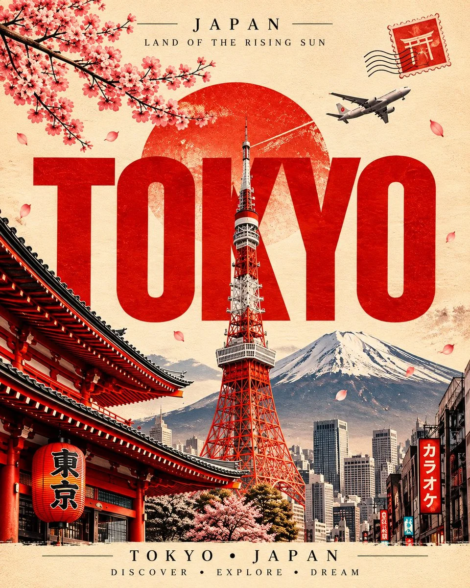
Crimson City Names Rise Over Layered Landmarks in Vintage Poster Art
Warm aged paper, deep red condensed type, and realistic landmarks stack into a nostalgic luxury postcard with petals, stamps, and film grain.
Prompt
Copied. Make it your own here.
Prompt prefilled · Suggested: GPT Image 2.6 Flare · 4 credits/image
Create a highly realistic vintage-inspired premium travel poster for [CITY NAME], [COUNTRY], based on the visual language of classic illustrated travel postcards.

Aspect ratio: 4:5 vertical.

Main Composition

- Warm vintage textured paper background with subtle aged-paper grain.
- Large bold uppercase [CITY NAME] typography dominating the middle of the poster.
- The city name must be deep red / crimson, with a slightly distressed vintage print texture.
- Place the main iconic landmark of [CITY NAME] vertically through or behind the large typography, creating a layered editorial composition.
- Add several recognizable landmarks of the city naturally around the main landmark:
  [LANDMARK 1], [LANDMARK 2], [LANDMARK 3].
- Keep the landmarks highly realistic, detailed and recognizable.
- Add a large circular vintage sun / sky element behind the main landmark, with subtle distressed texture.
- Create a cinematic travel-photography atmosphere while maintaining a classic vintage postcard aesthetic.

Decorative Elements

- Elegant flowering branches extending diagonally from the upper-left corner, adapted to the city's visual identity.
- A few small falling petals/leaves distributed naturally through the composition.
- Vintage postage stamp in the upper-right corner featuring a recognizable symbol or landmark from [COUNTRY].
- Add subtle postal cancellation lines around the stamp.
- Include a realistic airplane flying across the upper-right sky with a subtle contrail.
- Add small architectural and street details around the lower portion to make the city feel alive.

Typography Layout

At the top:

[COUNTRY]

[SHORT COUNTRY/CITY TAGLINE]

Below, the enormous central title:

[CITY NAME]

At the bottom:

[CITY NAME] • [COUNTRY]

[WORD 1] • [WORD 2] • [WORD 3]

Use elegant classic serif typography for the small text and an extremely bold condensed display font for the huge city name.

Color & Grading

Use a refined vintage color palette specifically inspired by [CITY/COUNTRY].

Warm aged-paper tones combined with deep red typography and carefully selected accent colors related to the city.

Use slightly faded colors, subtle film grain, distressed print texture, natural shadows, realistic atmospheric depth and premium editorial color grading.

The poster should feel like a luxury collectible travel postcard, not a modern digital advertisement.

Style

Ultra-realistic landmark details, realistic architecture, sophisticated vintage travel-poster design, premium editorial composition, realistic photography blended with vintage print aesthetics, authentic paper texture, subtle imperfections, elegant visual hierarchy, balanced negative space, highly detailed, crisp focus, sophisticated and timeless.

Important: Keep the overall design structure consistent with a classic vintage travel postcard, but make the color palette and visual accents unique to [CITY NAME].

No cartoon style, no 3D toy look, no excessive text, no clutter, no distorted landmarks, no random buildings, no duplicate landmarks, no watermark, no modern UI elements.
Published: November 19, 2026 by Hassan