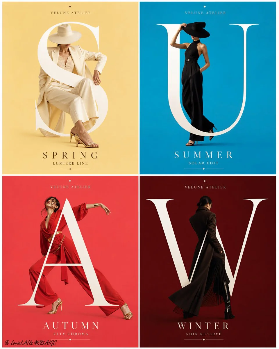
Image ChatGPT Image 2
Dancer weaves through oversized white letters on gray stage
A dancer moves between massive white typography, creating a dynamic interplay of body and letterforms in a minimal studio setting.
Prompt
Create an ultra-premium 2x2 poster campaign board for a fictional contemporary movement-theater brand, designed as a Cannes-award-level performance advertising system with extreme realism, immaculate typographic control, and collector-grade print finish. Preserve the exact structural logic of four equal poster panels arranged in a clean 2-by-2 grid, each panel functioning as part of one unified stage-performance campaign. Every poster must feature one anonymous full-body dancer as the central visual hero, oversized bold white English title typography layered across the figure, fine geometric wireframe constructions interacting with the pose, a refined neutral studio-gray background, a minimal brand signature near the top, and a precise information block near the bottom. The final board must feel like an official flagship launch campaign for a world-class contemporary dance theater: graphic, emotional, modern, and publication-ready.

Core system:
Use a perfectly aligned 2x2 grid with identical margins, consistent spacing, equal poster proportions, and one invisible master layout governing all four panels. Each poster must share the same design grammar:
1. minimal brand signature at the top,
2. one anonymous dancer dominating the composition,
3. huge uppercase white title typography spanning across and behind the body,
4. elegant geometric wireframe structures extending from the body and pose direction,
5. a clean lower information zone with opening-night style details.
The entire board must read as one disciplined master campaign, not four separate posters.

Brand identity:
Invent a refined international movement-theater label such as:
KINETIC FORM STAGE
Use it subtly and consistently near the top of each poster. All visible wording must be newly invented and original. Do not copy any titles, dates, or text from the reference. Do not include any real person names.

Body, typography, and layering:
The relationship between dancer, typography, and line geometry is the most important visual engine of the campaign.
- some letters must sit behind the dancer,
- some parts of the body may overlap in front of the title,
- the body must remain readable and elegant,
- typography must feel massive and architectural without destroying anatomy,
- the dancer and title must feel fused into one editorial composition,
- geometric wireframes must appear to extend from motion, weight, balance, and spatial tension,
- all overlaps must feel crisp, deliberate, and premium.
The result should feel like choreography translated into graphic design.

Poster 1, lyrical extension:
Create a ballet-inspired poster with a graceful anonymous dancer in a long elongated pose, one arm reaching upward and one leg extended with precision. Use a deep charcoal-gray studio background with soft spotlight falloff. Overlay a huge stacked white title:
SILK
TIDE
Some letters should pass behind the torso while one limb or shoulder subtly overlaps in front. Add a faceted wireframe prism or stretched spatial cone emerging from the lower body and extended leg, as if the pose is generating architecture. Bottom information block:
OPENING SERIES
OCTOBER 12
8 PM

Poster 2, angular force:
Create a stronger contemporary-dance poster with a powerful split, wide extension, or angular grounded pose. Use a cool mid-gray studio background. Overlay a monumental white title:
OPEN
FORM
Let the leg span and torso cut dynamically through the typography. Some letter strokes should be hidden by the body while a hand, foot, or arm crosses forward. Add precise radiating wireframe lines and polygonal planes connected to the lower body and feet. The composition must feel sharp, athletic, and high-fashion. Bottom information block:
FIRST PERFORMANCE
NOVEMBER 03
8 PM

Poster 3, theatrical tension:
Create a more dramatic poster with an anonymous dancer in a darker sculptural costume silhouette, balanced on one leg or in a stretched off-axis pose. Use a textured soft-gray backdrop with subtle tonal depth. Overlay a large white title:
EMBER
FIELD
or another similarly elegant two-word title if needed, but keep the same scale logic. Add a tall narrow wireframe tower or elongated geometric structure rising from one arm or leg, intensifying vertical tension. The mood should feel emotional, avant-garde, and stage-driven. Bottom information block:
LIMITED RUN
SEPTEMBER 18
8 PM

Poster 4, airborne impact:
Create a high-energy poster with an anonymous dancer captured midair in a curled leap, explosive contraction, or sculptural jump. Use a refined medium-gray studio field. Overlay a bold stacked white title:
WILD
PULSE
The body must collide visually with the letterforms in a controlled way, with some limbs disappearing behind letters and one contour overlapping forward. Add a crystalline wireframe volume or suspended faceted geometry beneath and around the jump, as if motion compresses space into sharp form. Bottom information block:
LIVE PREMIERE
DECEMBER 07
8 PM

Typography and information system:
Use huge white uppercase neo-grotesk or refined sans-serif typography with perfect spacing, sharp edges, and strong poster authority. Maintain consistent type hierarchy across all four posters:
- small brand line at top,
- oversized title in middle,
- compact information block near bottom,
- optional tiny venue URL or location line in restrained small type.
Keep the titles bold and minimal. The information blocks must be aligned consistently and feel like part of one mature campaign system.

Geometric line language:
The fine-line structures must be delicate, precise, and premium. Use thin white or pale-gray wireframe polygons, perspective rays, triangular volumes, and crystalline spatial outlines. These must never feel random. They should connect directly to weight distribution, pointing feet, bent knees, extended hands, torso axis, or jump trajectory, as if motion is leaving geometric residue in space.

Photography and realism:
Push every dancer, garment, fabric fold, muscle tension, studio shadow, skin detail, and footwear element to elite editorial realism. Use soft but directional studio lighting, accurate anatomy, clean retouching, premium tonal control, and a restrained luxury mood. The dancers must remain anonymous, elegant, and non-celebrity. No named identities.

Color and print finish:
Keep the overall palette sophisticated and restrained: charcoal gray, concrete gray, smoke gray, white typography, and only very subtle accent use in the information blocks if needed. Emphasize collector-grade print quality, paper grain, smooth tonal transitions, crisp white type edges, clean borders, and a final art-poster finish suitable for gallery walls, design annuals, theater foyers, and cultural billboards.

Creative emphasis:
Combine three layers in one final board:
Orbit-level impact through stronger body extension, more explosive poses, and more commanding title-body collisions;
Transit-level maturity through stricter grid logic, unified typography hierarchy, identical information-zone discipline, and cleaner geometric consistency;
Port-level completeness through luxury print texture, final campaign-board polish, and a fully resolved collector-edition theater-poster atmosphere.

No copied titles, no real person names, no awkward anatomy, no messy wireframes, no cheap entertainment-poster styling, no stock-photo feeling, no cluttered layout, no weak typography, no random graphic effects.
Published: August 6, 2026 by Loriel.AI