Image ChatGPT Image
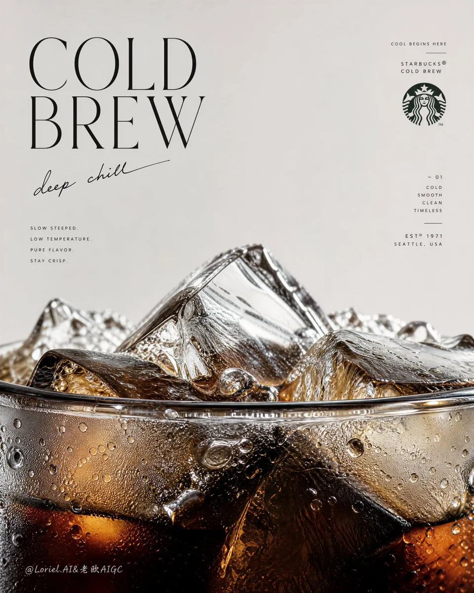
Dark coffee depth contrasts with crystalline ice formations
Extreme close-up of cold brew's meniscus and transparent ice blocks, creating a monumental, tactile horizon of chilled luxury.
Prompt
Create an ultra-premium vertical advertising poster for Starbucks Cold Brew, preserving the same minimalist editorial skeleton while pushing the image into a more flagship, more sculptural, and more internationally fashion-magazine-level direction. Keep the composition built from a large field of clean negative space in the upper half and an extreme macro close-up of the cup rim, cold brew surface, and ice structure dominating the lower half. The final result should feel like a hybrid of a world-class Starbucks campaign, a luxury beverage poster, and a collectible international magazine cover: light, cold, precise, modern, and visually unforgettable.

The hero product is Starbucks Cold Brew shown in an extreme macro close-up focused on the very top rim of the cup. The lower half of the poster must be dominated by the cup edge, the liquid meniscus, and a dense frozen landscape of crystal-clear ice rising above the rim. The cup should emerge from the bottom edge of the frame so only the upper portion is visible, making the viewer feel intimately close to the drink. The rim must be hyper-realistic: thin transparent edge, subtle glass thickness, wet reflections, elegant refraction, tiny cold condensation beads, meltwater traces, and perfect surface tension. The cold brew inside must feel dark, deep, and luxurious, with black-brown density, amber undertones, chilled transparency, and beautiful depth beneath the ice.

Push the cold-drink identity to an even more extreme level. The interaction between coffee and ice should be astonishingly rich in detail: large angular ice cubes, fractured transparent planes, trapped air bubbles, melting edges, floating smaller ice fragments, cold condensation droplets clinging to the cup, micro-beads of water, faint cooling haze, and sharp liquid transitions where dark coffee meets thinner translucent zones. The lower macro area should feel like an icy coffee world or a cold-brew geological cutaway, highly tactile and physically believable.

Preserve the same poster logic, but boldly reconstruct the lower beverage zone into a more sculptural and iconic frozen landscape. Let the ice cluster at the rim feel less like ordinary drink styling and more like a monumental cold-brew horizon: cracked clear ice peaks, wet reflective ridges, dark liquid depth below, subtle meltwater channels, and refined tonal separation between transparent ice, amber light, and dense coffee shadow. The drink should feel monumental while remaining product-true and hyper-real.

Refine the upper text system completely so it feels lighter, colder, and more like the cover language of an international design or lifestyle magazine. Use a clean, airy, editorial English title such as "Cold Brew" or "COLD / BREW" with elegant spacing, taller vertical rhythm, and restrained sophistication. Pair it with a short handwritten-style line that feels cool, intelligent, and fresh, such as "deep chill", "slow and cold", "stay crisp", or "cool begins here". Add a very subtle Starbucks siren mark or official brand signature, plus a few tiny editorial fragments or fine-line supporting copy arranged with the intelligence of a collectible magazine cover. Typography must feel black or deep charcoal, crisp, modern, slightly fashion-oriented, and premium, with only the most restrained use of Starbucks green if needed.

The text composition must no longer feel warm or cafe-like. It should feel colder, more airy, more modern, and more internationally editorial. Let the title float with elegant asymmetry, the handwritten note arc gently or lean lightly through the negative space, and small copy fragments behave like magazine-cover coverlines without clutter. The typography should echo the line of the rim and the geometry of the ice below, creating a strong dialogue between graphic design and product form. The upper half should feel spacious, calm, and expensive.

Lighting must be extremely soft, crisp, and premium, with more coolness and brightness than a standard coffee ad. Use delicate highlights on ice edges, refined reflections on the cup rim, wet sparkle on condensation droplets, soft luminous gradients inside the coffee, and impeccable tonal control from deep cold-brew brown to translucent amber to icy clear highlights. Every ice fracture, droplet, and liquid shift must feel macro-photography-grade, razor-sharp yet elegant. The realism must be extreme, but the mood remains clean, quiet, cold, and premium.

Keep the palette tightly controlled: pale cool beige or soft stone background above, deep cold-brew brown, near-black coffee depth, translucent amber light, clear ice highlights, soft silver-gray chill reflections, and only minimal restrained Starbucks green for tiny brand cues. The final image should feel like a world-class Starbucks flagship cold-drink poster and a collectible magazine-cover object at the same time: hyper-real cold brew, monumental ice detail, refined cold editorial typography, minimal official branding, luxury cooling atmosphere, premium print texture, and ultra-sharp detail.

Avoid cluttered layout, avoid too many props, avoid full-cup dominance, avoid muddy liquid, avoid weak ice detail, avoid warm cozy coffee-shop typography, avoid excessive green, avoid cheap poster design, avoid cartoon illustration style, avoid chaotic composition, avoid low-detail condensation.
Published: July 21, 2026 by Loriel.AI