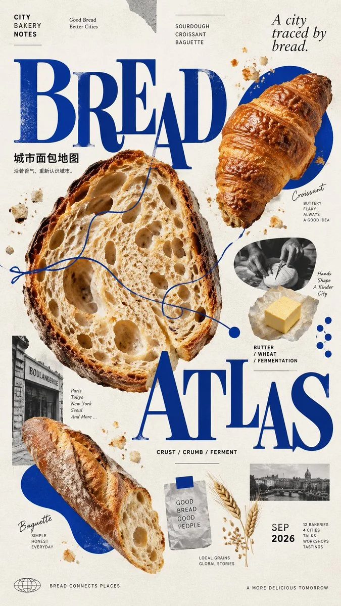
Image ChatGPT Image 2.5
Designing a High-End Editorial Poster with Controlled Scatter Composition
Create a visually rich editorial poster featuring one dominant anchor and multiple supporting nodes with clear scale hierarchy and consistent visual grammar.
Prompt
【Theme】{e.g. sound art, food culture, urban typography, botanical archive}
【Project / Brand】{name}
【Main Title】{2–4 words}
【Primary Subject】{main visual anchor}
【Satellite Elements】{4–8 supporting images, objects, textures, or details}
【Accent Color】{one dominant accent color}
【Background】{warm ivory / charcoal black / bold flat color}
【Key Information】{date, place, materials, categories, short tagline}
【Aspect Ratio】9:16

Create a high-end contemporary editorial poster using a controlled scatter composition. The layout should feel visually rich and exploratory, but never random. Build the composition around one dominant visual anchor supported by 4–8 satellite nodes distributed across the page.

Establish clear L / M / S scale hierarchy: one large anchor, 2–3 medium nodes, and several small detail nodes. Avoid equal-sized elements or regular grids. Use differences in scale, spacing, cropping, overlap, and direction to create rhythm and a non-linear reading path.

Typography must actively participate in the composition rather than sit in a conventional header block. Use the main title as one of the largest graphic elements, allowing words or letters to be split, offset, cropped, or distributed across the layout while remaining clearly readable. Keep the type system to no more than two complementary font families.

Combine editorial photography, cutout objects, material studies, archival fragments, close-up details, and simple graphic shapes. Supporting nodes should reveal different aspects of the same subject rather than repeat the same image. Mix complete subjects with fragments, textures, process details, and small visual evidence.

Use one repeated visual language to unify the scattered elements: repeated circles, organic shapes, rectangular fragments, line systems, material textures, or a single accent color. Position is scattered, but the visual grammar must remain consistent.

Limit the palette to one base color, black / neutral tones, and one strong accent color. Repeat the accent color in 3–5 separated locations to visually connect the composition. Avoid using many unrelated colors.

Maintain approximately 20–30% effective negative space. Do not fill every empty area. Related nodes may sit closer together, while unrelated groups should have more distance so the viewer naturally understands the hierarchy.

All text must have real meaning related to the project. Include only useful information such as the project name, categories, materials, date, location, short descriptors, or a concise tagline. Avoid placeholder copy, random words, meaningless Japanese text, decorative numbering, copyright text, or watermarks.

The final poster should feel like a finished cultural or brand project, combining contemporary East Asian editorial design, experimental graphic composition, and sophisticated visual storytelling. From a distance, the viewer should immediately read the main title, dominant subject, and accent color; up close, additional materials, process details, textures, and small information nodes should gradually appear.
Published: September 14, 2026 by Larus Canus