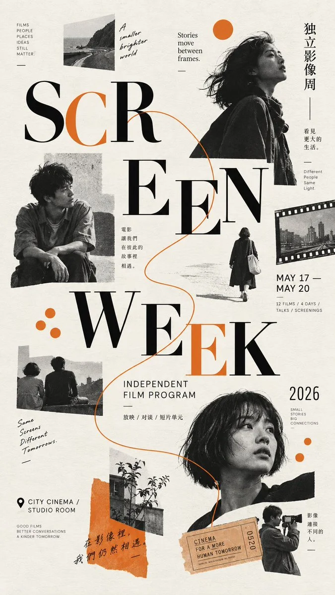
Image ChatGPT Image 2.5
Designing a High-End Editorial Poster with Dynamic Figure-Led Scatter Composition
Create a visually dense yet balanced editorial poster featuring a dominant figure and layered supporting elements, unified by a restrained color palette and experimental typography.
Prompt
【Theme】{e.g. contemporary dance, urban running, independent film, industrial design}
【Project / Brand】{name}
【Main Title】{2–4 words}
【Primary Figure / Object】{main human figure or dominant object}
【Secondary Nodes】{3–7 supporting figures, body details, objects, materials, or archival images}
【Accent Color】{one strong accent color}
【Background】{warm ivory / charcoal black / deep navy / another restrained base}
【Key Information】{date, place, categories, materials, short tagline}
【Aspect Ratio】9:16

Create a high-end contemporary editorial poster using a figure-led scatter composition. The poster should feel energetic, layered, and visually dense without becoming chaotic. Build the composition around one dominant human figure, object, or typographic anchor, then distribute 4–8 supporting nodes around it using strong differences in scale, direction, cropping, and spacing.

Use a clear L / M / S hierarchy: one oversized anchor, 2–3 medium visual nodes, and several small detail nodes. Supporting elements may include additional figures, cropped hands or feet, close-up product details, material studies, archival photography, equipment, textures, data, or process images. Each node should reveal a different aspect of the same theme rather than repeat the same subject.

Typography must behave like part of the visual system. Allow the main title to be split into large word or letter groups, placed across different areas of the page while remaining readable. Let selected figures or objects pass in front of and behind large letters to create believable depth and strong figure–type interaction. Keep one main spatial interaction as the focal surprise rather than making every element overlap.

Use pose direction, body movement, object orientation, repeated geometric forms, or a restrained line system to create a readable visual path through the scattered elements. The composition may move diagonally, circularly, or through a controlled sequence, but should never feel randomly distributed.

Choose one visual motif to unify the composition, such as open arcs, circles, cropped rectangles, material fragments, condensed type, repeated data marks, or one consistent photographic treatment. Position may vary, but the visual grammar must stay consistent across the entire poster.

Keep the palette restrained: one base background, black / neutral imagery, and one strong accent color. Repeat the accent in only 3–5 separated locations so it acts as a visual connector rather than covering the whole poster.

Maintain approximately 20–30% effective negative space. Do not fill every gap. Large visual anchors need breathing room, while related supporting nodes can form tighter clusters.

All text must be meaningful and relevant to the project. Use only useful information such as project name, date, location, categories, materials, performance data, product specifications, or a short thematic statement. Avoid placeholder text, meaningless Japanese, decorative numbering, copyright copy, or random micro typography.

The final image should feel like a finished campaign or cultural poster: contemporary East Asian editorial design, experimental typography, real photography, strong hierarchy, and controlled visual tension. From a distance, the viewer should immediately notice the dominant figure or object, the large title, and the accent color; up close, smaller images, materials, movement details, and project information should gradually reveal themselves.
Published: September 14, 2026 by Larus Canus