Image ChatGPT Image 2.6
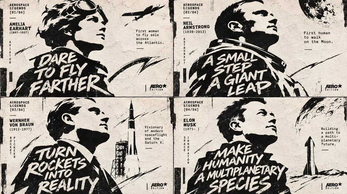
Four Aviators Carved in Ink and Negative Space
Each aerospace figure emerges as a stark silhouette, its message fused into the neck and shoulder mass, while calligraphic strokes and tiny editorial microtype animate the asymmetric poster layout.
Prompt
Copied. Make it your own here.
Prompt prefilled · Suggested: GPT Image 2.6 Flare · 4 credits/image
2x2 grid, 16:9, do this for 4 aerospace legends: INPUT = [HUMAN]

V = {
  PROFILE    : side profile | 3/4 profile | cropped bust,
  FEATURE    : one defining trait | hairstyle | accessory | facial feature | symbolic cue,
  TEXT       : 2–4 line message,
  LOGO       : footer mark | imprint | publication tag,
  TYPE       : scribbled block lettering + editorial microtype,
  MARKS      : calligraphic strokes | stencil fragments | vertical accents,
  TEXTURE    : rough ink print | raw paper grain,
  FORMAT     : vertical poster | editorial cover
}

C₁  HUMAN IDENTITY + SILHOUETTE (master)
    reduce [HUMAN] to an unmistakable profile portrait with one amplified [FEATURE]; prioritize recognizable head shape, nose/forehead/chin rhythm, hairstyle or accessory cues, and a strong cropped bust silhouette.
    ¬C₁ = generic face / weak likeness / front-facing portrait / no defining feature.

C₂  BLACK-SHAPE PORTRAIT CONSTRUCTION
    build the figure from bold black silhouette masses, sharp white cutouts and fragmented stencil-like shape blocks; use negative space to carve the profile rather than drawing detailed facial features.
    ¬C₂ = realistic rendering / soft modeling / full facial detail / weak contrast.

C₃  RAW EDITORIAL SURFACE
    apply rough ink edges, distressed print breakup, raw off-white paper and subtle screenprint/stencil irregularity; the image should feel printed, tactile and slightly imperfect.
    ¬C₃ = glossy finish / clean digital polish / smooth gradients / sterile vectors.

C₄  BODY-AS-TYPOGRAPHIC CONTAINER
    place one large readable text block "[TEXT]" only inside the neck/body area; set it in 2–4 stacked lines of oversized scribbled lettering fused into the silhouette mass, clearly readable but physically embedded.
    ¬C₄ = text floating outside body / tiny copy / clean corporate type / unreadable scribbles.

C₅  MICROTYPE + VERTICAL ACCENT SYSTEM
    add tiny editorial microtext, narrow vertical type accents and small information fragments around the portrait to create magazine-poster tension; these support hierarchy but never overpower the main text block.
    ¬C₅ = no secondary typography / cluttered info overload / decorative filler with no structure.

C₆  CALLIGRAPHIC ENERGY MARKS
    introduce expressive hand-drawn marks, swipes or ink gestures that echo the subject's mood and animate the composition; keep them asymmetrical and integrated with the black silhouette architecture.
    ¬C₆ = random doodles / symmetrical decoration / overly polished ornament.

C₇  ASYMMETRIC POSTER TOPOLOGY
    use a cropped vertical composition with the portrait dominating, generous negative space, off-center balance and a dynamic editorial layout. Emphasize silhouette first, embedded text second, microtype third.
    ¬C₇ = centered formal portrait / flat static layout / weak hierarchy.

C₈  FOOTER IDENTITY MARK
    include a small graphic-design-style footer logo reading "[LOGO]" near the bottom edge, functioning as an imprint or publication mark; keep it crisp, minimal and subordinate.
    ¬C₈ = oversized logo / random badge / logo competing with portrait.

η   EXPERIMENTAL EDITORIAL COHERENCE
    stark black/white impact, recognizable human profile, embedded scribbled message, tactile print roughness, sharp negative space, asymmetrical modern-poster energy, highly inspectable editorial finish.

FORBIDDEN = realistic shading · front-facing portrait · weak silhouette · text outside body area · glossy rendering · decorative clutter · oversized footer logo · centered static layout · full-color treatment · over-detailed facial features
Published: November 16, 2026 by Gadgetify