Image ChatGPT Image 2
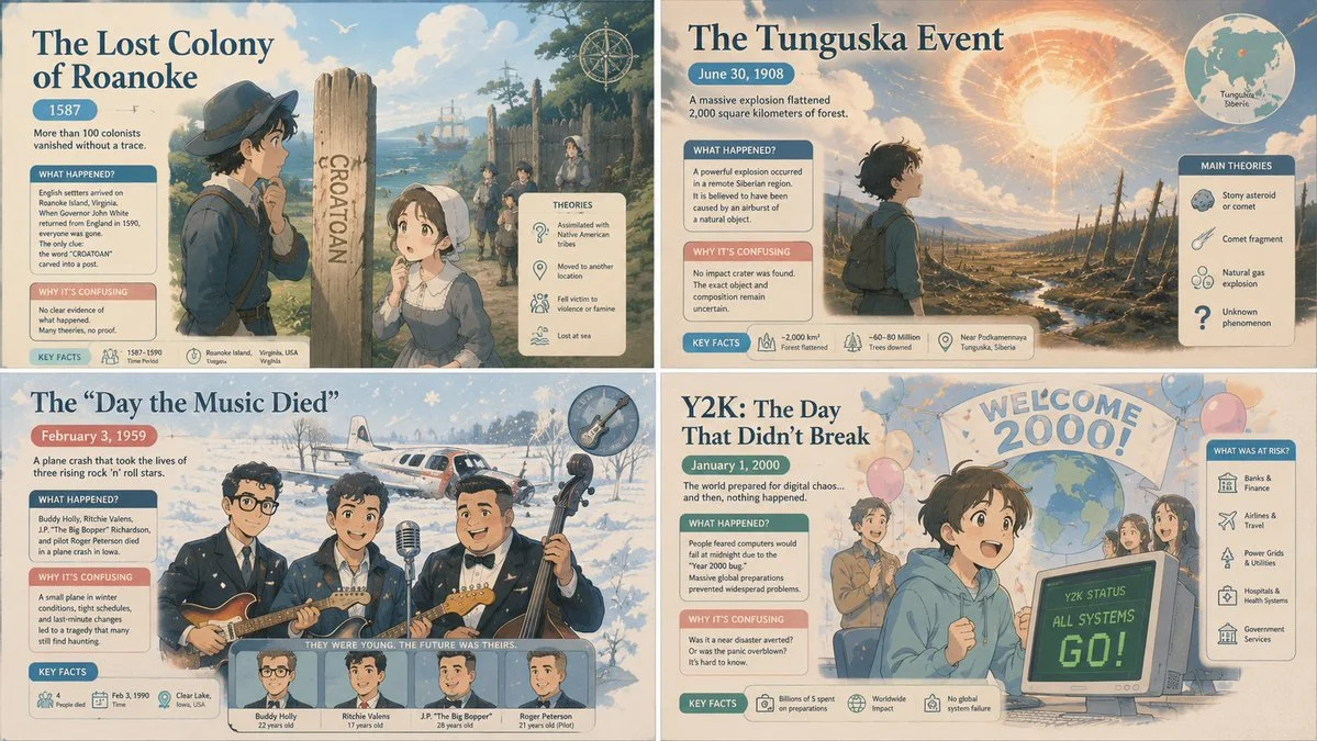
Four confusing days in history as pastel anime poster
A 2x2 grid of cute anime scenes depicting historical confusions, with soft pastel colors and civic poster style.
Prompt
2x2 grid, 16:9, do this for 4 confusing days in history: Style = {
  <pastel_public_service_anime_cinema>
  MEDIUM: Soft editorial infographic illustration fused with stylized anime-cinematic scene design.
  SURFACE: Matte paper texture, gentle grain, lightly speckled poster finish, soft digital paint with clean simplified rendering.
  FORM: Cute stylized characters and readable symbolic objects placed inside a clear poster-like composition.
  COLOR: Public-service pastel palette with sky blue, medical blue, mint green, blush pink, cream, pale coral, and soft beige, accented by a few darker blue anchors.
  LIGHTING: Bright soft ambient light overall, with selective dramatic shafts of light and mild cinematic glow around the central subject.
  COMPOSITION: Clear poster hierarchy with a strong central focal subject, simplified surrounding figures, readable supporting icons, and broad background shapes.
  MOOD: Hopeful, civic-minded, emotionally uplifting, but with an undercurrent of seriousness and heroic urgency.
  </pastel_public_service_anime_cinema>

  <transformation>
  - Convert the subject into a stylized anime-inspired figure or object placed within a clean public-information poster layout.
  - Reinterpret surrounding elements as simplified symbolic support graphics, civic icons, educational motifs, or narrative support figures.
  - Convert realism into soft rounded shapes, approachable cartoon proportions, and emotionally readable facial or focal expressions.
  - Balance gentle infographic clarity with subtle cinematic staging and heroic emphasis.
  - Rebuild complex environments as simplified scenic backdrops with broad readable forms, soft atmosphere, and reduced clutter.
  - Convert intense action, tension, or conflict into softened poster drama: readable, emotional, and symbolic rather than gritty or graphic.
  - Use emblematic objects, badges, shields, charts, globes, or institutional motifs to support the composition when relevant.
  - Preserve the subject identity, but make it feel like the centerpiece of a noble public-awareness campaign with anime-cinematic charm.
  </transformation>

  <shape_language>
  - Favor rounded silhouettes, clean outlines, soft geometry, and approachable figure design.
  - Keep secondary figures simple and readable.
  - Use icon-like props, large symbolic forms, and poster-friendly spatial arrangement.
  - Let emotional storytelling come through pose, spacing, and composition rather than dense detail.
  </shape_language>

  <rendering_rules>
  - Keep surfaces soft and matte.
  - Use subtle paper grain and pastel color blocking.
  - Avoid hard realism; keep facial and figure design stylized and cute.
  - Let the composition read clearly from a distance like an educational poster.
  - Add just enough cinematic atmosphere to create emotional lift.
  </rendering_rules>

  <finish>
  - Pastel public-service anime poster aesthetic.
  - Soft, hopeful, symbolic, and clean.
  - Educational editorial clarity fused with character-centered cinematic emotion.
  </finish>

  <avoid>
  - Avoid gritty gore, realism, or harsh tactical detail.
  - Avoid dense background clutter.
  - Avoid overly dark palettes or aggressive contrast.
  </avoid>
}
Published: June 30, 2026 by Gadgetify