Image ChatGPT Image 2.5
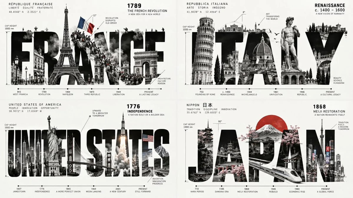
Four countries rebuilt as typographic engines in a 2x2 grid
A 2x2 grid where each country's name becomes a landscape, machine, and timeline, with events fracturing the letters and a hero object embedded inside.
Prompt
Copied. Make it your own here.
Prompt prefilled · Suggested: GPT Image 2.5 Flare · 3 credits/image
2x2 grid, 16:9, do this for 4  famous countries: INPUT: $ SUBJECT

// ============================================================
// SEMANTIC TYPOGRAPHY ENGINE

S = research_and_infer($ SUBJECT)

WORD = shortest_recognizable_name(S)

DATE = most_defining_date_or_period(S)

EVENTS = rank_defining_events(S)

E1 = EVENTS[0]

ICON = select_one_immediately_recognizable_object(S)

MOTION = infer_dominant_force(S)

//
// FIRST PRINCIPLE

DO NOT illustrate $ SUBJECT next to its name.

BUILD $ SUBJECT INSIDE ITS NAME.

WORD becomes:

    landscape
    architecture
    timeline
    diagram
    stage
    machine

simultaneously.

// GLYPH STRUCTURE

Construct WORD in enormous condensed black capitals.

Each glyph is treated as architectural volume.

Within / through the letters:

roads may travel
crowds may gather
objects may protrude
walls may crack
machines may operate
buildings may rise
waves may flow
aircraft may cross
figures may climb
landmarks may replace strokes

// EVENT SIMULATION

Convert E1 into a physical force acting on typography.

EVENT_FORCE = map(E1)

Examples:

explosion      → radial fracture
discovery      → reveal / aperture
revolution     → letters overturn
expansion      → glyphs stretch outward
collapse       → broken baseline
flight         → aerodynamic crossing
migration      → repeated figures traverse letters
invention      → mechanical assembly
war            → impact scars / division
unification    → disconnected glyphs interlock
digitalization → modular pixel fragmentation

The event must alter letter geometry.

// HERO OBJECT

ICON is rendered as a small three-dimensional object
or miniature physical model.

It intersects the typography rather than floating outside.

Possible placements:

inside counter
crossing stroke
balanced on baseline
emerging through fracture
replacing letter segment
casting shadow over type

// IDENTITY MANUAL LAYER

Around WORD place a rigorous corporate design-sheet system.

Include only meaningful construction information:

    cap height
    glyph width
    angle
    trajectory
    timeline
    radial origin
    structural axis
    relevant dimensions

Use arrows and engineering labels.

Example:

        1969
          ↓
   ╭────────────────────╮
   │     A P O L L O    │
   │      ↑       ↗     │
   │ LANDER   trajectory│
   ╰────────────────────╯

Do not overload.

Approximately 6–14 annotations.

// HISTORICAL MICRO-TIMELINE

Along one edge place 3–6 tiny dates or stages.

Example grammar:

ORIGIN ─── DEVELOPMENT ─── BREAKTHROUGH ─── LEGACY

But replace these with actual subject-specific events.

Typography:
    tiny technical grotesk.

// STYLE HYBRID

STYLE =

    International Typographic Style
    × aerospace engineering manual
    × architectural construction drawing
    × museum exhibition identity
    × monumental condensed typography
    × miniature physical diorama
    × mid-century corporate design documentation.

// VISUAL RULES

Background:
    clean white / very pale warm gray.

Primary:
    black.

Secondary:
    one subject-specific accent color.

Optional tertiary:
    muted gray.

No gradients except realistic shading on the physical ICON.

Typography:
    extremely bold,
    condensed,
    monumental.

Technical annotations:
    hairline weight.

Therefore visual contrast:

████████████████
heavy semantic type

───────────────
ultra-thin engineering logic

// SUBJECT-SPECIFIC GLYPH MUTATION

for glyph in WORD:

    if glyph resembles subject object:
        mutate(glyph, subject_object)

    if event trajectory crosses glyph:
        carve_path(glyph)

    if architecture is relevant:
        extrude_into_building(glyph)

    if historical rupture is relevant:
        fracture(glyph)

    if growth is relevant:
        extend(glyph)

    if movement is relevant:
        shear(glyph)

Maintain minimum 85% word readability.

// MICRO-DIORAMA OPTION

Selected portions of letters may become shallow physical
miniatures.

Example:

letter cavity →
    miniature street

crossbar →
    bridge

stem →
    tower

baseline →
    landscape

counter →
    arena / harbor / planet / laboratory

Tiny people or vehicles may populate them.

Keep scale disciplined.

// COMPOSITION

             DATE

   ┌──────────────────────┐
   │                      │
   │  █████████████████   │
   │  █   SUBJECT    ██   │
   │  █████████████████   │
   │     ↗    ↑     ↘     │
   │ trajectory event icon│
   │                      │
   └──────────────────────┘

      timeline ──────────→

All technical content surrounds,
but never visually defeats,
the enormous central word.

// NEGATIVE RULES

NO conventional poster illustration.
NO logo placed above a picture.
NO fake blueprint decoration.
NO arbitrary dimensions.
NO multiple unrelated hero objects.
NO generic typography.
NO colorful comic clutter.

The WORD itself must communicate
what happened,
how it happened,
and why SUBJECT matters.

// OUTPUT

A severe black-and-white identity specimen in which
the subject's name becomes a functioning miniature world,
its defining event physically transforms the glyphs,
a single iconic 3D object interacts with the typography,
and precise corporate-construction annotations explain
the geometry like a lost industrial design document.
Published: October 23, 2026 by Gadgetify