Image ChatGPT Image 2.5
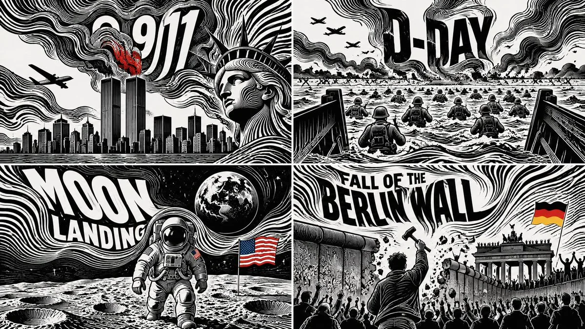
Four days that changed history shown in a 2x2 grid of line fields
Four pivotal historical days each rendered as a 16:9 grid cell where black and white streamlines form the subject, with typography embedded in the flow.
Prompt
2x2 grid, 16:9, do this for 4 days that changed history: INPUT: $ SUBJECT

// ========================================================
// 1. SEMANTIC FIELD EXTRACTION
// ========================================================

S = analyze($ SUBJECT)

NODES = {
    identity     : core_visual_identity(S),
    concepts     : rank(core_concepts(S), count=4..7),
    symbols      : infer_visual_symbols(S, count=5..12),
    word         : shortest_recognizable_label(S),
    direction    : infer_dominant_motion_or_logic(S),
    hierarchy    : semantic_importance(S)
}

// ========================================================
// 2. CONSTRUCT VECTOR FLOW FIELD
// ========================================================

For image coordinates p=(x,y):

F(p) =
      Σ attractor(symbol_i, weight=importance_i)
    + Σ repulsor(negative_space_j)
    + directional_bias(direction)
    + silhouette_boundary_force(identity)

Integrate streamlines:

γ'(t) = F(γ(t))

Generate 40–120 continuous black/white bands
following γ(t).

// ========================================================
// 3. SUBJECT EMERGENCE
// ========================================================

The subject must NOT simply sit on top of the pattern.

Instead:

FLOWLINES → bend around recognizable features
FLOWLINES → become contours
FLOWLINES → enter and exit silhouettes
FLOWLINES → expand into negative space
FLOWLINES → merge into symbols
FLOWLINES → become letters where useful

Recognition should happen through deformation of the field itself.

Example semantic behavior:

importance ↑
    => line density ↑
    => contour convergence ↑
    => larger graphic mass

secondary concept
    => smaller disturbance in flow.

// ========================================================
// 4. TYPOGRAPHIC INTEGRATION
// ========================================================

WORD = NODES.word

Do not typeset WORD conventionally.

Transform each glyph into a physical interruption of the field:

letter_stroke ≈ stream_bundle
counterspace ≈ negative vortex
baseline ≈ local flow trajectory

Possible placements:
- embedded inside the central silhouette
- emerging from the streamlines
- becoming an architectural/object feature
- serving as an optical attractor

Typography must remain readable at thumbnail scale.

// ========================================================
// 5. ICON TRANSFORMATION
// ========================================================

for symbol in NODES.symbols:

    symbol.geometry =
        simplify(symbol)
        → silhouette
        → stripe_deform()
        → merge_with_field()

Do not paste clipart icons.

Every symbol must appear native to the same
black/white visual physics.

// ========================================================
// 6. COMPOSITION
// ========================================================

Choose layout automatically from subject structure:

IF subject == singular_icon:
    central vortex composition

ELIF subject == process:
    left→right directional current

ELIF subject == place:
    horizon / skyline flow

ELIF subject == abstract_idea:
    human/object metaphor silhouette

ELIF subject == comparison:
    two competing vector basins

ELSE:
    asymmetric poster composition

ASCII topology:

        ≋≋≋≋≋≋≋≋≋
    ≋≋≋      ◉      ≋≋≋
  ≋≋     [SUBJECT]      ≋≋
 ≋      ╱╱ WORD ╲╲        ≋
  ≋≋    symbols ↝       ≋≋
     ≋≋≋≋≋≋≋≋≋≋

// ========================================================
// 7. STYLE
// ========================================================

PALETTE:
    92–100% black + white

optional accent:
    exactly ONE subject-derived color
    occupying < 6% image area.

SURFACE:
    crisp screenprint / vector-like ink

LINE:
    thick,
    smooth,
    hypnotic,
    continuous,
    variable spacing.

BACKGROUND:
    clean white,
    generous negative space.

OUTPUT:
A high-impact semantic Op-Art poster in which $ SUBJECT,
its concepts, symbols, typography, and directional logic
are all generated from one continuous optical flow system.

Avoid:
generic zebra stripes,
decorative waves unrelated to content,
ordinary infographic boxes,
realistic shading,
gradients,
stock icons,
random text.
Published: October 17, 2026 by Gadgetify