Image ChatGPT Image 2
Professional Brand Guideline Board
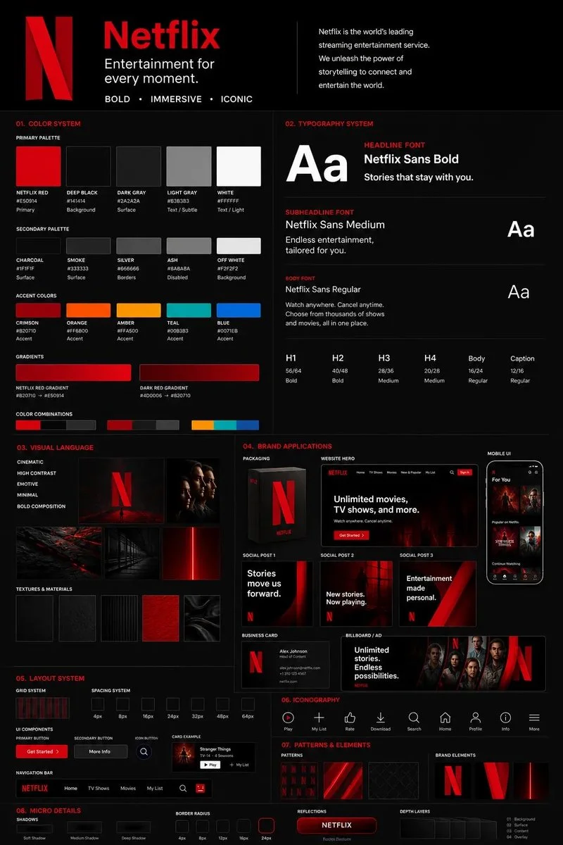
A highly detailed and structured brand guideline, showcasing typography, color palettes, and visual elements. Each component is carefully designed to reflect the brand's core values, ensuring clarity and consistency across applications.
Prompt
This must feel like a real professional brand guideline board
CORE RULE:

Everything must be derived from the uploaded logo:
- colors
- style
- tone
- personality

No generic outputs.

STRUCTURE (VERY IMPORTANT):

Vertical 4:5 poster
Multi-layered grid system
Dense but clean composition

TOP SECTION:

- Brand name (clean typography)
- Short brand statement (max 6 words)
- 3-word brand identity (e.g. “Modern / Bold / Minimal”)

COLOR SYSTEM (ADVANCED):

- Primary palette (3–5 colors)
- Secondary palette (3–5 colors)
- Accent colors

For each:
- large color blocks
- HEX codes (short)
- usage indicators (primary / highlight / background)

Add:
- gradient examples
- color combinations

TYPOGRAPHY SYSTEM:

- Headline font style
- Subheadline style
- Body text style

Show:
- real text examples (short phrases)
- hierarchy clearly visible

VISUAL LANGUAGE:

Define:
- image style (editorial, cinematic, minimal, etc.)
- lighting direction
- texture / material inspiration

Show:
- 3–5 visual tiles (image-style previews)

BRAND APPLICATIONS (VERY IMPORTANT):

Show multiple realistic mockups:

- product packaging
- website hero section
- mobile UI screen
- social media posts (3 variations)
- business card
- billboard or ad

Each must feel consistent with the brand.

LAYOUT SYSTEM:

- UI blocks
- card components
- spacing system

Show:
- buttons, cards, layout examples

ICONOGRAPHY:

- 6–10 icons in brand style
- consistent line / fill style

PATTERNS & ELEMENTS:

- background patterns
- decorative shapes
- visual motifs derived from logo

MICRO DETAILS (TO SHOW POWER):

- shadows
- material textures
- reflections
- depth layers

VISUAL STYLE (CRITICAL):

- modern editorial + tech design hybrid
- extremely clean but information-rich
- layered composition
- strong hierarchy

Typography:
- bold titles
- clean supporting text

DEPTH:

- 30–50 visual elements total
- mix of large + small components
- dense but organized

IMPORTANT RULES:

- no empty space
- no generic placeholders
- everything must feel intentional
- all elements must visually connect

FINAL FEEL:

Like:
- a Behance top project
- a real agency brand guideline board
- something clients would pay for

NOT:
- basic
- minimal
- template-like
Published: May 2, 2026 by simeon-sanai