Image ChatGPT Image 2.5
Six-Panel Cinematic Color Grading Sheet Reveals Dramatic Mood Shifts
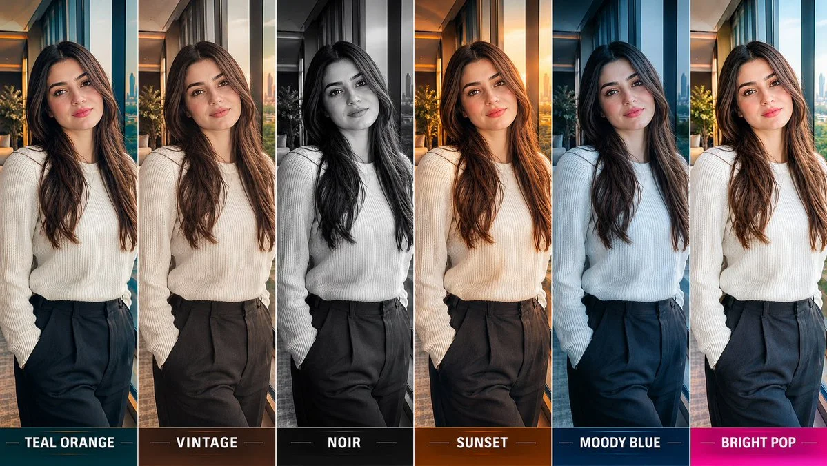
A professional contact sheet displays the same portrait under six distinct film color grades, from teal-orange to noir, highlighting how lighting transforms atmosphere.
Prompt
UNIVERSAL CINEMATIC COLOR GRADING CONTACT SHEET

Identity-Locked | Six Cinematic Looks | Professional Photography
REFERENCE IMAGE: Use the uploaded photo as the primary and authoritative reference for the person.
OBJECTIVE: Transform the reference photo into one professional six-panel cinematic color grading comparison sheet, similar to a movie colorist's visual lookbook.

IDENTITY & COMPOSITION LOCK

Preserve the exact person's facial identity, skin tone, hairstyle, body proportions, clothing, pose, and overall appearance.

Keep the same scene, background, camera angle, framing, subject position, and perspective in all six panels. Only change the cinematic color grading, lighting mood, tonal contrast, and atmosphere.

SIX CINEMATIC COLOR GRADING STYLES

PANEL 01 — TEAL ORANGE
Cinematic teal shadows, warm orange highlights, rich contrast, natural skin tones, premium Hollywood action-film aesthetic.

PANEL 02 — VINTAGE
Warm faded colors, subtle film grain, muted browns, soft contrast, nostalgic analog-film atmosphere.

PANEL 03 — NOIR
Deep blacks, dramatic shadows, dark cinematic contrast, restrained highlights, mysterious thriller-film mood. Use monochrome only if appropriate to the desired noir style.
PANEL 04 — SUNSET
Golden-hour warmth, amber highlights, glowing sunlight, rich warm tones, cinematic sunset atmosphere.

PANEL 05 — MOODY BLUE
Cool blue and cyan shadows, subdued saturation, deep blacks, atmospheric contrast, dramatic nighttime-film aesthetic.
PANEL 06 — BRIGHT POP
Bright, vibrant colors, crisp contrast, luminous highlights, clean details, energetic commercial-film aesthetic.

LAYOUT & PRESENTATION
Arrange all six versions side by side in one wide, horizontal contact sheet. Give each panel equal width and height.

Use the following clear labels at the bottom of each panel:
TEAL ORANGE | VINTAGE | NOIR | SUNSET | MOODY BLUE | BRIGHT POP

Use clean, minimal typography, consistent framing, and a polished professional color-grading comparison layout.
STRICT CONSISTENCY RULES

All six panels must show the exact same person.
Keep the original pose, expression, outfit, and background unchanged.

Do not generate six different photographs or alter the person's identity.

Do not change camera framing, body proportions, or scene composition.

Apply each color grade consistently across the entire image.

Preserve realistic skin texture and recognizable facial features.
Avoid excessive saturation, artificial skin tones, distorted anatomy, and unnecessary visual effects.
FINAL OUTPUT
Generate one professional six-panel cinematic color grading sheet that clearly demonstrates how different color treatments change the mood of the same photograph.
RESOLUTION LOCK: Generate final images in 16K resolution — 15360 × 8640 pixels (≈132.7 million pixels), 16:9 aspect ratio.
FINAL PRIORITY: Exact identity preservation, identical composition across all panels, clearly differentiated cinematic color grades, and professional presentation.
Published: October 11, 2026 by M. Asif