Image ChatGPT Image 2.5
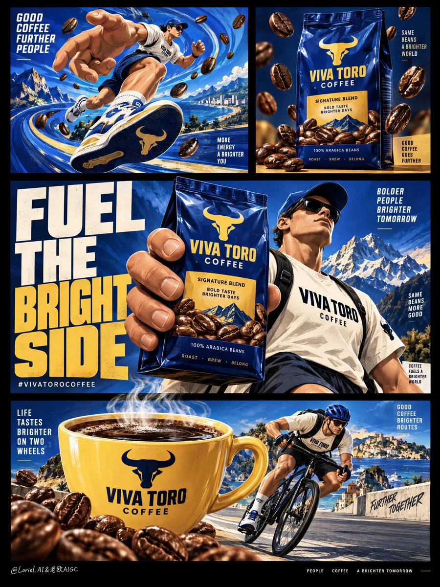
VIVA TORO coffee bag repeated at three scales on black campaign board
Premium illustrated coffee campaign board with cobalt-blue bag, giant cup, and athletic mascot across multiple panels on deep black background.
Prompt
Create a premium illustrated coffee campaign board for a fictional international brand named VIVA TORO COFFEE, designed as a single vertically composed multi-panel poster on a deep black background, where bold editorial layout, oversized graphic limbs, and product-led storytelling merge into one collectible advertising image. The final image must integrate Orbit, Transit, and Port at the same time: immediate commercial impact, systemized brand versatility, and curatorially reduced visual sophistication. Preserve the structural logic of the reference as pure composition language only: multiple clean rectangular panels floating inside a black field, one dominant middle statement panel, one product-focused upper-right panel, one energetic upper-left action panel, and one wide lower panel built around a giant branded coffee cup and an athletic character.

The commercial product is the coffee brand itself, expressed through a hero coffee bag, a large steaming cup, scattered roasted beans, and a recurring athletic mascot system. The pack must remain shelf-ready and clearly legible inside the illustration world: upright premium flexible bag, rich cobalt-blue body, warm golden label zone, bold brand mark, believable gusset folds, glossy laminate reflections, sharp edges, and appetizing coffee imagery. The cup must be equally iconic: oversized yellow ceramic cup with printed brand identity, dark coffee surface, visible steam plume, smooth glazed reflections, and strong graphic silhouette. The product assets must remain visually dominant across the board, even while the human figures and giant hands create motion and personality.

The illustration style is premium commercial graphic art, not childish cartooning. Use bold shape language, vector-clean contour logic, controlled shadow blocks, subtle grain or print texture, expressive but disciplined brush energy, and highly curated panel composition. The visual world should feel modern, playful, and international, like a Cannes-winning FMCG campaign or an award-winning beverage poster series. The human figures are stylized yet believable, with clear anatomy and controlled exaggeration: athletic adult bodies, clean limb articulation, readable hands, correct finger count when visible, oversized hands and shoes used intentionally as part of the brand language, not as anatomical errors. Their movement should feel active and rhythmic: running, striding, cycling, or carrying the force of caffeine through the composition.

Upper-left panel: a dynamic blue motion field with swirling abstract coffee-energy patterns, a giant illustrated hand integrated into the scene, and a sporty mascot character in motion, as if the brand is physically propelling the body forward. The hand and character relationship must feel witty and graphic rather than random. Upper-right panel: a more reduced product-first composition centered on the coffee bag, with roasted beans suspended or falling around it in clean spatial rhythm, highlighting pack clarity and shelf impact. Middle main panel: the strongest commercial statement, with one giant hand gripping the hero coffee bag beside a large athletic character standing or stepping forward, supported by massive bold typography that acts as both message and graphic block. Bottom wide panel: a large steaming coffee cup dominates the scene while a cyclist or active consumer character interacts with it, using the cup as a scale-distorting object of desire and energy.

The color system must be highly controlled and brand-strong: 55% saturated cobalt blue and deep roast-blue, 20% warm golden yellow and toasted bean amber, 15% cream white and pale highlight accents, 10% black field and deep coffee-brown anchors. The black outer background must feel like a gallery wall framing the bright commercial worlds within. Let the internal panels contain most of the color, while the outer black field provides sophistication, breathing room, and a premium editorial finish. The movement textures inside the blue fields should feel like liquid caffeine currents or energetic roast waves, not generic decoration.

Typography is a major graphic force and must be elegant within its boldness. Use only English visible text. In the central panel, create one large campaign line with huge condensed uppercase lettering, such as "FUEL THE BRIGHT SIDE" or "WAKE THE MOTION", integrated into the scene as a structural block. Add the brand name "VIVA TORO COFFEE" on the pack and cup, and one short bottom-line hashtag or call phrase only if needed. Avoid information clutter, small promotional paragraphs, or supermarket-flyer noise. The type must feel like part of the poster architecture, tightly locked to the panel grid and giant-hand composition.

Material semantics must remain explicit even inside the illustration language: glossy coffee-bag laminate, roasted bean oil sheen, ceramic cup glaze, coffee liquid depth, steam softness, bicycle frame gloss, sporty fabric folds, sneaker rubber edge, and crisp panel borders. The image should function both as a powerful single poster and as a scalable brand system whose scenes could be extracted into separate ads. That Transit quality must be present in the design logic: every panel feels modular, but the whole remains one unified premium campaign object. The Port quality must also be present: remove low-value clutter, reduce unnecessary mini-elements, widen negative space where possible, and let the strongest gestures, products, and type do the work.

Rendering target: premium graphic-illustration FMCG campaign, product-dominant hierarchy, international editorial grid, clean brand modularity, reduced but powerful storytelling, bold collectible print finish, and world-class commercial poster clarity.

Structured exclusion constraints: no real coffee brand names, no copied source text, no cheap clip-art feel, no childish cartoon simplification, no muddy colors, no cluttered panel noise, no unreadable typography, no random letters, no extra fingers, no fused fingers, no broken limb logic, no low-end retail flyer look, no style drift, no AI slop.
Published: September 21, 2026 by Loriel.AI